
The text you use in your graphic design project is arguably the most important element. Why? It’s everywhere. From books to signs to our phones, people are constantly exposed to text.
When someone visits your website, or is exposed to your brand for the first time, the text is where they go to find information. While the text is important, you wouldn’t include it if it wasn’t, you need to consider how it looks in your design. When the font fits your design and character of your brand, you can create a visually stimulating and memorable experience. Choosing the right font for your design is an important process and can take time. As with most things, there are certain trends you see from year to year. Here are some of the top trending fonts in 2020 to help you choose an appropriate font that fits your design and brand.

Helvetica
Helvetica is a widely used sans-serif, a letterform that does not have extending features, typeface that was developed by Max Meidinger in 1957. 63 years later and this font is still seen everywhere, from the signs in the New York City subway system to the logos of big brands such as American Airlines and American Apparel. This is a popular font with designers due to its simplicity and practicality.

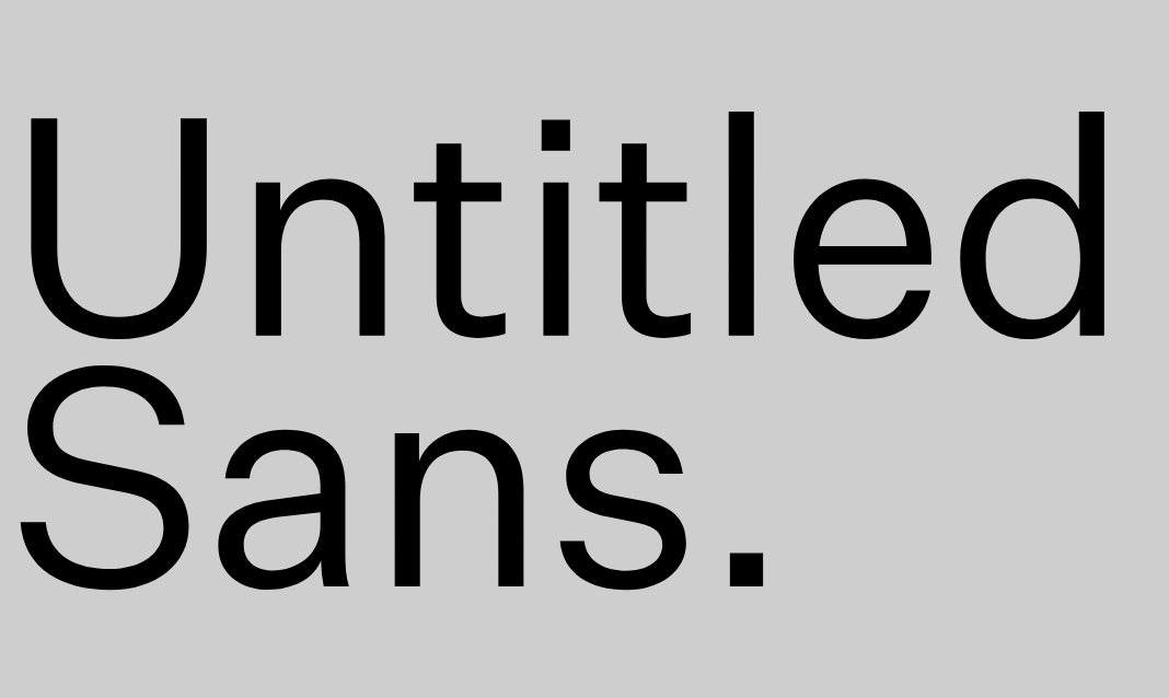
Untitled Sans
Kris Sowersby designed Untitled Sans in 2017 with the goal of creating an average font. Three years later and it has quickly become a favorite among designers looking for a font that does the job while remaining understated. Other simple fonts, such as Helvetica, are widely recognized as they are used everywhere. Untitled Sans, though a simple font and very popular, is not widely recognized.
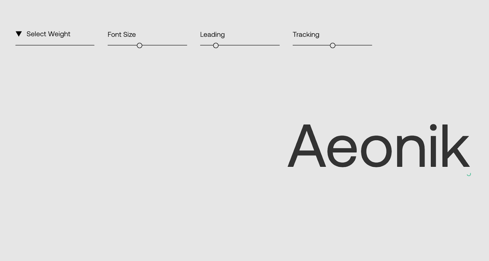
Aeonik
Born out of a collaboration between graphic designers Mark Bloom and Joe Leadbeater, Aeonik is a font described as a “structural workhorse, crafted with mechanical detail.” This font is ideal for use in logotype or editorial with it’s attention to detail at larger sizes. With seven weight options and italics, Aeonik consists of a well rounded family and character set, perfect for use throughout your brand for consistency.
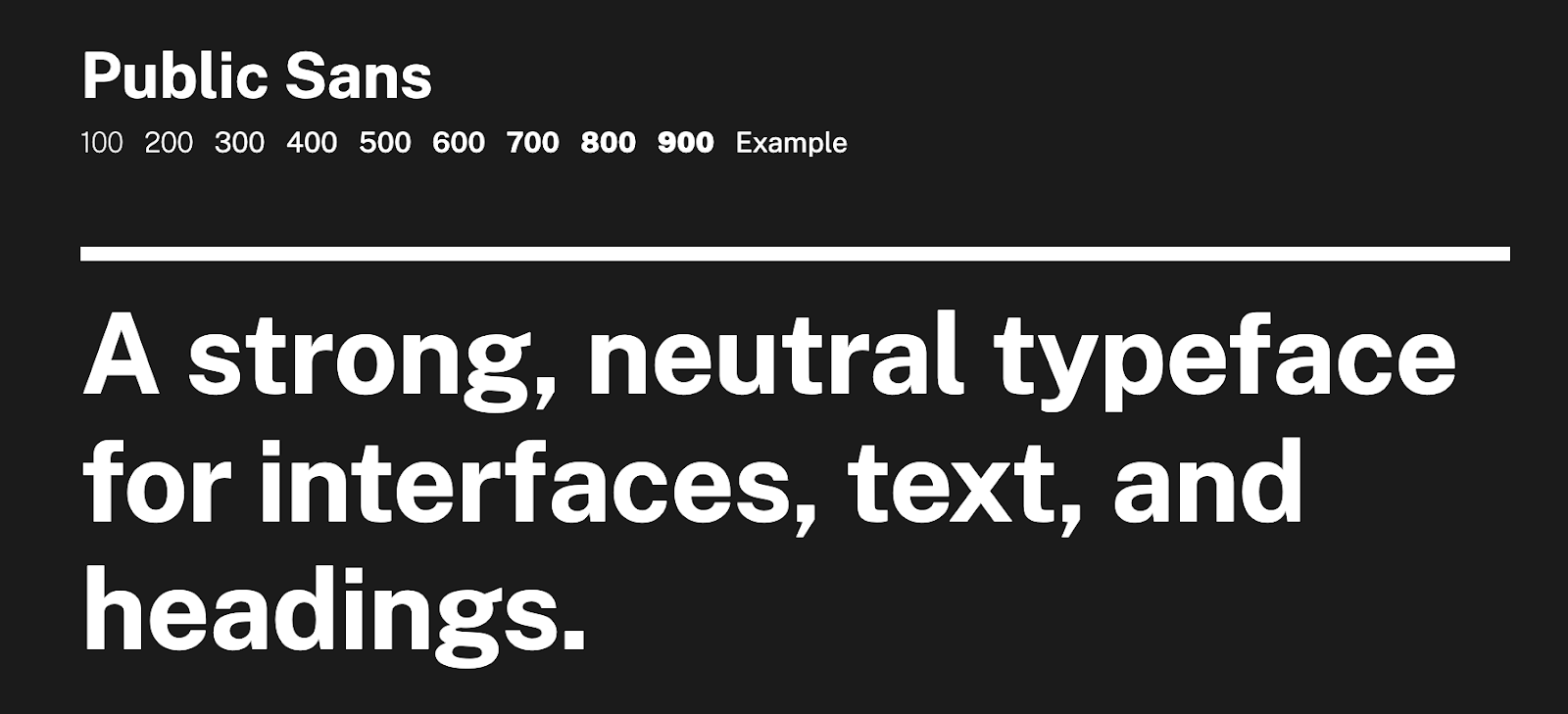
Public Sans
Public Sans is a completely free and open-source font similar to that of Helvetica. Bold yet simple, this font was created in 2019 by Dan Williams as part of the United States Web Design System 2.0, a set of coding and design guidelines that help government websites remain uniform.
Madera
Designed in 2018 by Malou Verlomme, this geometric sans has a bit more character than your average sans-serif typeface. Madera is bold with its sharpened apexes, the point of a character where two points meet, and unique crossbar, the horizontal bar across the middle of uppercase A and H, making it the perfect font for graphic posters and logos.
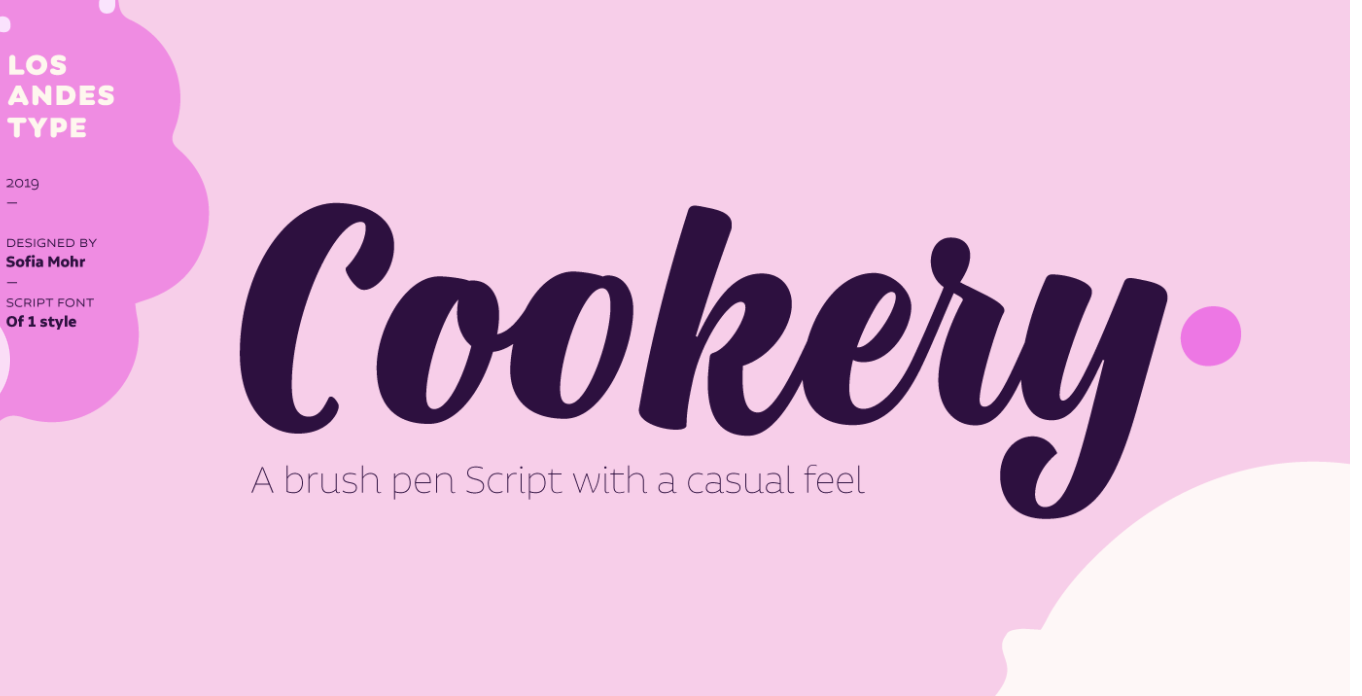
Cookery
Cookery is a contemporary hand-drawn, flowing brush type with irregular baselines. Script fonts such as this are often seen used in vintage logos. If you are looking for a font that mimics the human touch and adds dynamism, Cookery is the perfect font for you.
Tips for choosing a font for your design
There are thousands of fonts to choose from these days, making choosing the right typography for your graphic design project a difficult task. There are several things you should consider when looking for a font for your design.
- Your brand: the font you choose should reflect the identity and character of your brand. A Serif font portrays a sense of seriousness and reliability, whereas a sans-serif font gives off a more modern and clean vibe. Script fonts evoke a sense of romance and elegance. Find a font type that emits the same character as your brand.
- The message in your design: you want to choose a font that will speak to your target audience. Consider the emotion you want the design of your text to evoke and find a font that represents that.
- Legibility: you may have chosen a font that you love, but if it is not readable, it won’t do you any good. If people have to spend extra time trying to decipher what your text says, they will disregard your design. If you want to use a decorative typeface, they work best for titles and headlines.
- Serif vs. sans-serif: if you are trying to decide between serif or sans-serif fonts, consider your target audience. Sans-serif is ideal for readers with certain visual impairments or anyone just learning to read.
- Limit the number of fonts: while it is ok to use more than one font in a single design, you don’t want to over do it. Avoid using more than 2-3 fonts in your creative design, instead consider playing with the weight and size of the font you are already using.
- Avoid too similar fonts: if you are using more than one font, use decisive contrast. The easiest way to find two fonts that work well together is to find two that have one thing in common but are otherwise very different. The ideal combination of fonts should create harmony, fonts that look like each other tend to clash.
Finding the right font for your design that also matches the character of your brand can be a difficult process but it is one that should never be overlooked. Your choice in font plays an important role in setting the overall tone of your creative design and can make or break the experience your audience has. Checking out top typography trends each year can help you narrow down your decision.
If you are designing print marketing materials, be sure to embed your fonts by flattening your PDF. When a computer does have specialty fonts downloaded, which most printers will not, the fonts will be replaced with what the computer thinks is a similar font. To avoid this issue, it is easiest to flatten your file before sending it to your printer. If you have any questions about flattening your file or how to start printing, contact Printivity!


