
Designers are tasked with taking a product or project and presenting it in a way that entices your target audience while also remaining true to your brand and business goals. From picking out typography to choosing color schemes, designers are in charge of it all. Finding the perfect color combination for your design can be tough, but it is a step that should certainly not be overlooked. The colors you choose could end up being what brings your design to the next level, or what makes it blend in with all the other designs out there. Certain color combinations will grab your audience’s attention and (hopefully) inspire specific emotions. These are the designs that will stay with your audience.
Choosing color combinations with the color wheel
Understanding color theory, the color wheel and how colors interact with each other will help you when it comes to choosing successful color combinations. Knowing which colors work well together, and which one’s do not, will help you avoid color combinations that will hinder the effectiveness and visual appeal of your design.

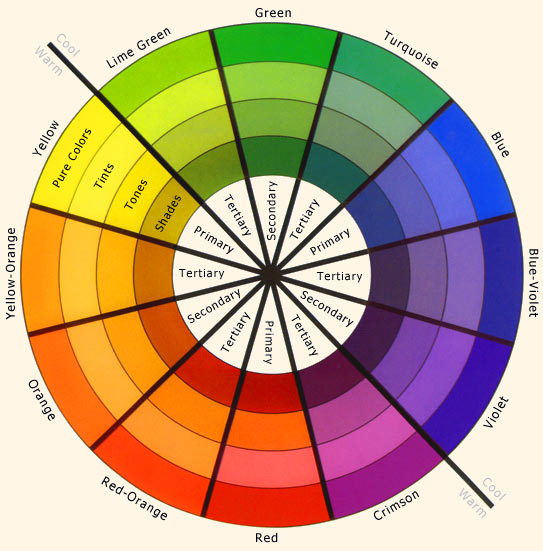
The color wheel is made up of twelve colors in total–Three primary colors (red, yellow and blue), three secondary colors (green, orange and purple) which are created by mixing primary colors, and six tertiary colors (blue-green, red-violet, etc.) which are created by mixing primary and secondary colors. If you draw a line through the center of the wheel, you will create a division between the warm colors (reds, oranges and yellows) and the cool colors (blues, greens and purples.)
Colors that work together create a color scheme, or color combinations, and can be found by using the color wheel.
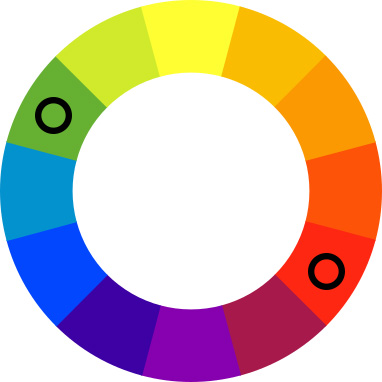
Complementary colors
Colors that are opposite of one another on the color wheel are considered complementary colors (think red and green or blue and orange). The high contrast of these colors will create a vibrant look and make your design pop, but can also be jarring for your audience when used in large doses. Complementary colors are great when you want an aspect of your design to stand out.
Pro tip: avoid complementary colors for text.
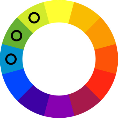
Analogous colors
Colors that are next to each other on the color wheel are considered analogous colors (think blue and green). These colors match well and create designs that are pleasing to the eye. To create contrast when choosing analogous colors, choose one color to dominate and a second to support it. The third color should be used as an accent.
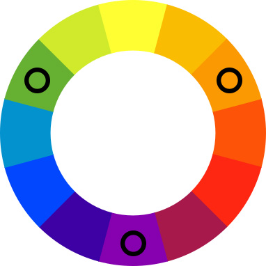
Triadic colors
Colors that are evenly spaced around the color wheel are considered triadic colors (for example, purple, orange and green). Triadic colors tend to be vibrant and should be carefully balanced. Try to use one dominant color and the other two for accents
Pro tip: decrease the saturation of your hues if your colors are too vibrant.
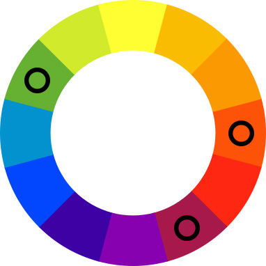
Split-complementary colors
A variation of the complementary color scheme, split-complementary colors uses the base color and the two colors adjacent to its complement, so instead of green and, you would have green and purple and orange. These colors have the same strong contrast as complementary colors, but less of the tension.
Pro tip: split-complementary color schemes are great for beginners as they are hard to mess up.
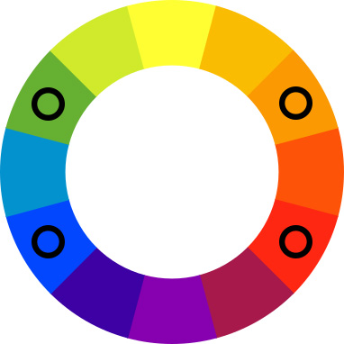
Tetradic (rectangle) colors
The tetradic, or rectangle, color scheme uses four colors that are arranged in two complementary pairs (for example, blue and red and green and orange). The tetradic color scheme works best if you choose one color to dominate and use the rest as accent colors.
Pro tip: be aware of the balance between warm and cool colors in your design.
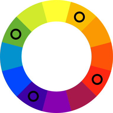
Square colors
Similar to tetradic colors, the square color scheme consists of four colors evenly spaced around the color wheel (for example, blue, red, yellow-orange and green). Like tetradic colors, square colors work best when you have one dominating color with three accents. Keep in mind the balance between the warm and cool colors when using a square color scheme in your design.
Use the 60-30-10 rule
As the name states, this rule involves using your colors in a 60% + 30% + 10% proportion. Using your colors this way allows the eye to move comfortably from focal point to focal point. 60% is your dominant hue (this could be background color), 30% is your secondary color (this supports your dominant hue) and 10% is for your accent color. The 10% color can either be more bold or more subtle, depending on the look you are going for. Keeping things in balance will create a cleaner design for the eye and be easier on your audience’s brain. You can achieve this with color schemes using more than three colors, but keep your color schemes to less than five!
Designing for print
If you are designing for print, it is important that you design in the CMYK color mode. Most professional print services print using the subtractive color model, CMYK. CMYK refers to the four ink plates used in professional color printing: cyan, magenta, yellow, and key (black). Designing in the RGB color space may result in a final printed product that does not accurately reflect your original design. If you have any questions, contact Printivity’s service department at 1-877-649-5463 or [email protected]


