
Whether you are designing something for social media, a print ad, or a book cover, if you’re including text in your design, it is imperative to choose the right font. The font does a lot in your design, such as representing your brand, increasing legibility, and contributing to the overall aesthetic. The funny thing about font though, is that you don’t normally notice it. Think about it, when is the last time you read something and thought about the font the designer used? Probably never, or at least not very often. You only notice font if it’s exceptionally beautiful or outrageously hideous. Fortunately, these days there are thousands of fonts out there for you to choose from. Unfortunately, that makes it easier to choose the wrong font for the look and feel you are trying to achieve. Here are the 5 worst fonts to use in design.

What makes a font bad?
When it comes to the worst (and even the best) fonts to use in design, it’s not exactly set in stone. Though there is no strict ruling regarding what exactly makes a bad font, there does seem to be a broad consensus, especially when it comes to Comic Sans. The worst fonts have a few things in common such as they don’t align with our understanding and perception of balance, they are not legible, there is nothing unique about them, they try too hard to stand out and just miss the mark completely, or they are so overused they have simply lost their appeal.

Comic Sans
Everybody hates Comic Sans, that is pretty much a fact, making it one of the worst fonts out there. Designed in 1994 by Vincent Connare, Comic Sans was inspired by comic book type and was intended to be used for the speech bubbles of an animated cartoon dog, Rover. Rover was designed to help people navigate the Microsoft Windows user face and was supposed to be friendly and playful. In 2002, two typographers started a “Ban Comic Sans” movement, which quickly gained traction worldwide as designers from around the globe voiced their dislike for the font.

Trajan Pro
There does not necessarily need to be anything blatantly wrong with a font for it to be considered one of the worst fonts and an awful choice for your design. When it comes to Trajan Pro, it is so overused that no one wants to see it anymore. From movie posters to book covers, this font has been completely exhausted. Trajan Pro has been included in almost every edition of Adobe’s Creative Suite and was at a time one of only a few fonts available to designers. These days there are hundreds of thousands of fonts available to choose from, meaning you can branch out and choose a font that was not showcased on almost every single movie poster.

Franklin Gothic
Another font that is so overused it has lost its appeal in the world of digital design is Franklin Gothic. Often used to portray a “classic” look, Franklin Gothic has been used by bloggers and designers alike trying to build credibility. This font would be great for a newspaper, or if you’re really set on it, as a headline or other minor design element, but this font absolutely should not be used for the bulk of your design.
Pro tip: though some fonts are so overused they have lost their appeal, there are those other tried-and-tested fonts that will never get old. If you are looking for a timeless, classic font for your design, consider Orpheus, Canela or Avenir.
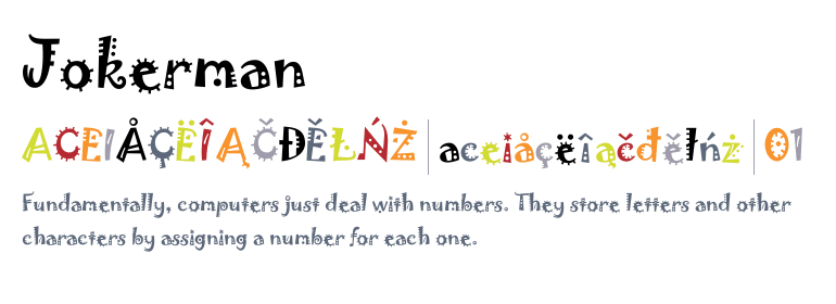
Jokerman
Legibility can make or break a font. Odds are if you are using text in your design, you want it to be legible. Jokerman is one of the worst unreadable fonts out there. The little curls, dots, and squiggles attached to each letter distract the audience from the text they are trying to read. Though this font is distinct and will leave an impression, it may not be the impression you are looking for. This font is hard on the eyes for anyone, but can cause extra problems for those with poor eyesight or dyslexia. Serifs and other text decorations can obscure the shapes of letters, making them run together. Sans-serif fonts allow dyslexic users to see the shapes of the letters clearer. The lack of decoration increases the space between the letters, making them more distinguishable.
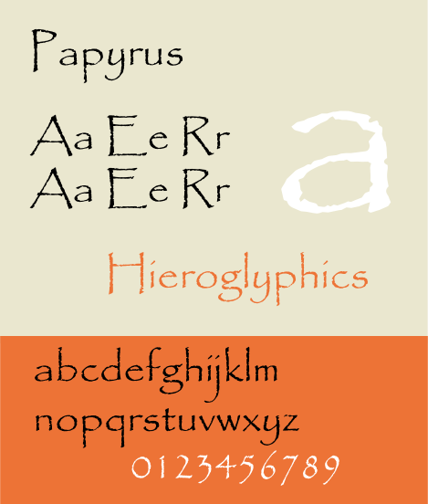
Papyrus
Yet another font that has been overused to the point where it is no longer popular, Papyrus makes the cut for one of the five worst fonts. Papyrus was initially a go-to because it was both simple and sophisticated. It was also one of the fonts that came preloaded in Word, which made it very convenient. Papyrus is often named one of the most overused fonts in a designer’s toolbox. If you’re looking to be original, it is best to avoid using this one in your design.
Pro tip: when you are choosing a font, think about the context it will be used in. Is this going to be a quick headline? A slogan that people will have to slow down and read? Also, consider if this is going to be a design for digital or print. The font you choose should not only look good but should also fit the style and goal of your design.
Embed your fonts into your PDF
It is crucial to embed your fonts in your PDF, especially if you are using a specialty font. Embedding fonts in your PDF file will allow anyone that opens your file to view the document as you intended. If you do not embed a font, the PDF viewer will substitute the font if it is not available on the computer being used to view the document. Though the computer will substitute the font with a similar one, it will not be exactly what you designed. This is an especially important step for documents designed for print. Most printers do not have specialty fonts downloaded and will replace them, resulting in an outcome you did not intend. If you have any questions regarding embedding fonts into your PDF, contact Printivity.


