
The world of graphic design can seem overwhelming in the beginning with the sheer volume of techniques and software available at your fingertips. Seemingly fun projects of designing invitations or flyers can quickly turn into a dreaded task you just can’t seem to cross off of your to do list. Fortunately, there are numerous tips and tricks out there to help even the most inexperienced of graphic designers to ace their next project. We’ve gathered up the top 8 graphic design tips for beginners so you don’t have to!
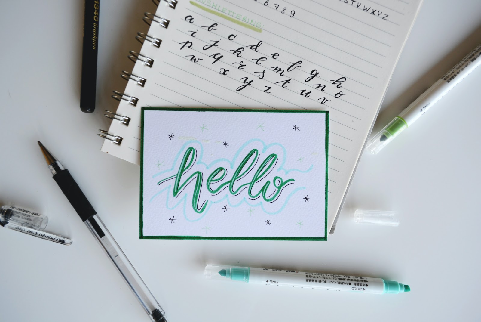
Font Matters and less is more
These days, there are thousands upon thousands of typefaces to choose from. You may be tempted to choose a different font for each line of text in your design. Don’t. When it comes to your design, readability is crucial, so in this case, less is more. Depending on the amount of text and how you lay it out in your design, you may even want to stick to a single font. Using multiple typefaces can make it harder for your audience to focus on the message of your design, rendering it ineffective.

Feel free to get creative with the typeface you choose, but make sure to find one that is easy on the eyes. If you happen to have headings, subtitles, body text, etc. in one design, consider using variants from the same font family to create emphasis on the different sections without creating too much distraction. It may take some experimentation to find the right font family for your design, but you will get there.
Pro tip: not all fonts are available for commercial use so make sure to check the license before using them in your projects.
Color is key
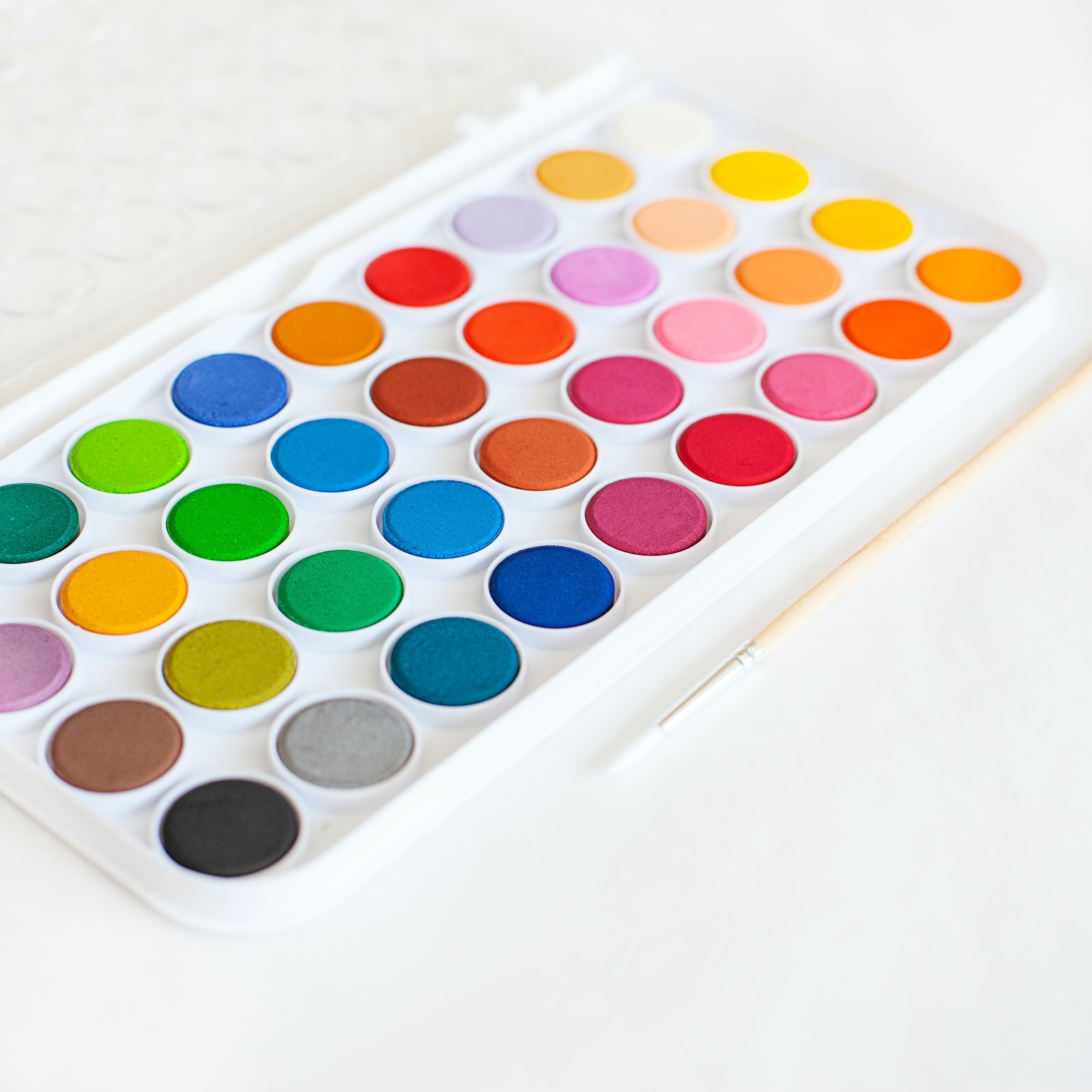
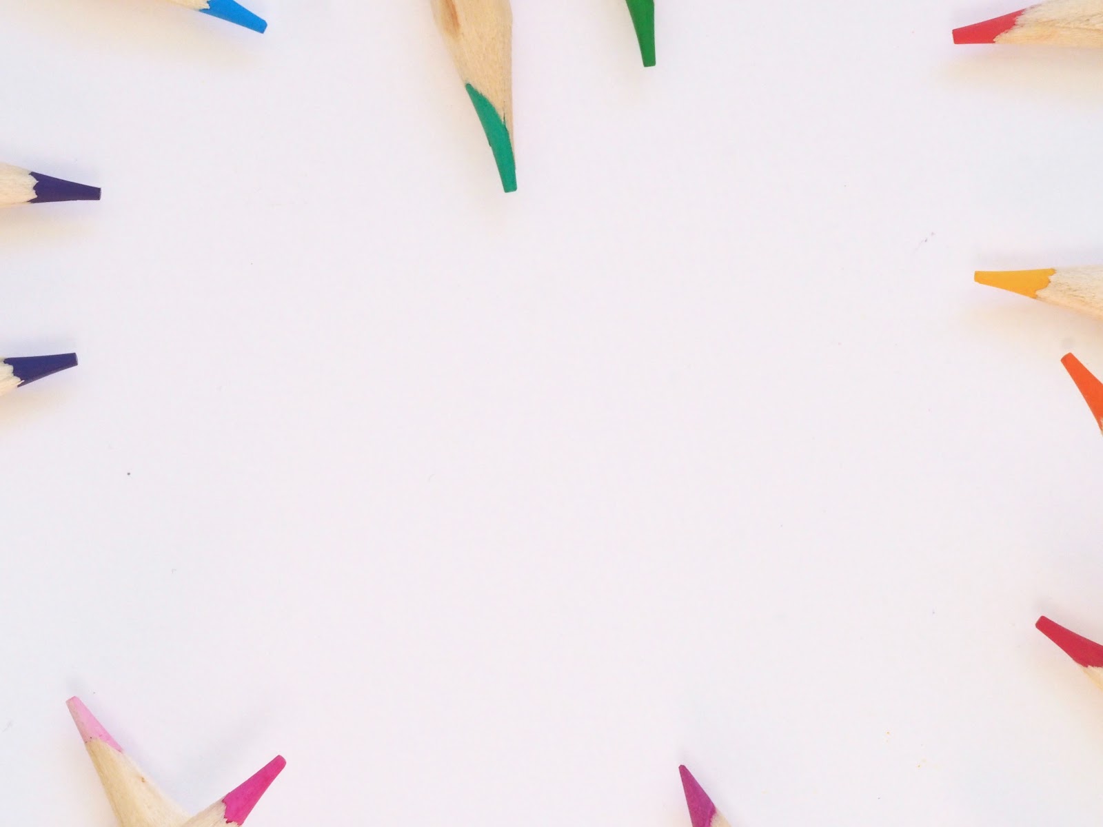
What is the first thing about a design that catches your eye? The color. Choosing a great color palette is key to a successful design. The idea of having to choose the perfect combination of colors may sound stressful, but it’s actually not nearly as difficult as you may initially think. If you’re working in the world of graphic design, odds are you have heard of the psychology of color. The first thing you want to consider when choosing a color palette for your design is what kind of emotions you want to elicit from your audience. The answer to this will help you narrow down your choices to two types of colors, warm or cool.
From there, you can choose the primary color that will set the tone of your design. Once you’ve selected the primary color you want to use, you’ll want to look at the colors that work with it. This can be difficult, but consulting the color wheel can help. Use the color wheel to identify color schemes such as complementary, analogous, or monochromatic.
Align the elements of your design
Proper alignment of the elements in your design will help create a professional, polished, and sophisticated look. There are several types of alignment, and the type you use will depend on your design.
- Horizontal alignment means that either the left or right (or both) margins of your design are equal. Depending on your design, horizontal alignment can apply across an entire page or in columns. Keep an eye on the “rag”, the white space that is left at the end of a left justified line of text. Too much rag can create a sense of visual misalignment which can negatively impact the readability of your design.
- Vertical alignment means that your elements are lined up with the top and/or bottom margins of the page. Similar to horizontal alignment, vertical alignment can apply to portions of your design or its entirety.
- Edge alignment means that your elements are lined up with each other’s top, bottom, or side edges. Edge alignment is not affected by the page margin.
- Center alignment means that your elements are aligned along a central axis. Center alignment creates a more formal look. This alignment is not ideal for designs with large amounts of text as each line starts in a different place, creating a design that is hard to read.
Pro tip: graphic design software offers tools such as grids and rulers to help achieve optimal alignment.
Utilize white space
White space, also known as negative space, is not the enemy. White space can help your design in a number of ways such as increasing readability. Think of book printing or print magazines and note the margin, the blank area between the text and the edge of the page. This margin, the white space, makes reading large amounts of text much easier. White space also helps create balance and symmetry in your design. Balance is one of the fundamental principles of design and refers to the way elements are distributed throughout your design. Put simply, white space establishes focus and balance while creating a clean and visually appealing design.

Be consistent
No matter how many elements you incorporate in your design, make sure you are consistent. Every graphic, diagram, image, illustration, and line of text you include should have a purpose. Consistency between the elements is what will tie them all together and make them work. Stay consistent in everything from your colors to your typeface, font size, spacing, and positioning. Beyond a single design, consistency can tie together all designs across a single campaign or brand, helping to distinguish your brand and campaign from others.

Flat design is your friend
Flat design has become an increasingly popular trend over the years. This technique is a minimalistic design approach that delivers your message fast. Flat design is best used when you need to communicate your message efficiently and get right to the point. For example, when you want to show your audience to “tap here” or “swipe this way” or if you are creating a manual or how-to guide that will walk your audience through step-by-step instructions.
Use lines to create style and order
One of the most basic visual elements really isn’t basic at all. Lines can be used in a variety of ways, from simply acting as content separators or boundaries between elements, to having more intricate roles by acting as guides. You can use lines to help guide a viewer’s eyes to a focal point, creating a sense of flow between each element. Lines can be used to emphasize elements or put stress on a word, phrase, or even an entire paragraph.
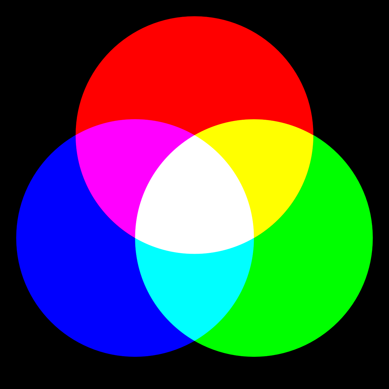
Know the difference between CMYK and RGB
CMYK and RGB are both modes for mixing color in graphic design. RGB is best for digital work and CMYK is best for print projects. RGB is an additive type of color mode that combines the primary colors of red, green, and blue in various degrees to create the desired colors. When all three colors are combined and displayed to their full extent, the result is white. When all three colors are combined to their lowest degree, the result is black.
CMYK is a subtractive type of color mode that utilizes the four colors of cyan, magenta, yellow, and black to create the desired colors when printing. Since this is a subtractive color, the addition of each color removes more light, meaning that the more colors you add, the darker the resulting color. If you add the first three colors, cyan, magenta, and yellow, the result is not black but a dark brown. Adding the final color, K (black) is what will completely remove light from the printed picture, resulting in what the eye perceives as black.
Pro tip: figure out what you are designing for before starting your project. If you begin your design in RGB but end up having to convert to CMYK for print, the colors you originally chose may change and you’ll have to adjust your design accordingly.
Need a designer ASAP? Printivity offers in-house graphic design services to help you bring your designs to life then sent to our printers. Fill out our quick form with details of your project, and we’ll get started!


