
Sir Isaac Newton established color theory in 1666 when he invented the color wheel. Color theory consists of a set of rules and guidelines that designers use to incorporate the best colors into their design to achieve the desired reaction from the audience. Using these rules and guidelines, designers will consult the color wheel to select the optimal colors for every design.

What is the color wheel?
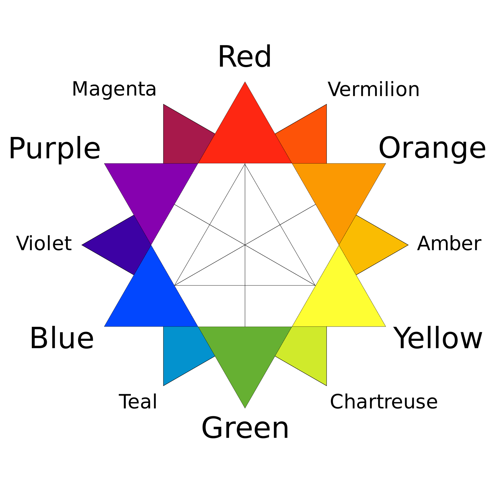
The first color wheel was designed by Sir Isaac Newton in 1666. The color wheel consists of three primary colors, three secondary colors and six tertiary colors.
- Primary colors are the colors of yellow, red and blue. In theory, primary colors are the root of every other color, because you can pretty much make any color by mixing together a variation of the primary colors.
- Secondary colors are the colors of orange, purple and green. These come directly from the primary colors, hence the naming of “secondary.” If you mix red and yellow, you get orange, if you mix red and blue, you get purple, and if you mix blue and yellow, you get green.
- Tertiary colors are the six remaining colors on the color wheel that come from both secondary and primary colors and are essentially different hues of the primary and secondary colors. For example, if you mix yellow and orange, you come away with a color that is somewhere in between. It is not quite yellow and it is not quite orange.

If you draw a line through the center of the wheel, you’ll separate the colors into two sections, warm colors and cool colors. Every color has a temperature of either warm or cool. Warm colors consist of red, orange and yellow. These colors tend to make you think of warm things such as sunlight and heat. Cool colors consist of blue, green and purple and can have calming and soothing effects on people. While warm colors make you think of warm things, cool colors make you think of cool things, such as water, ice or the sky.

Color hues
A color wheel consists of 12 colors, but there are seemingly endless possibilities when it comes to different color options these days. This is where tints, shades and tones come into play. Different hues of colors are achieved in a variety of ways depending on what hue you are looking to achieve.
- A tint is achieved by adding white to a color. For example if you add white to red, you achieve the color pink.
- A shade is achieved by adding black to a color. For example if you add black to red, you achieve burgundy.
- A tone is achieved by adding both black and white (or gray) to a color. The end result will be a color that is darker than its original hue but less intense.
Color schemes
Color schemes are combinations of colors that are developed using the color wheel. You can have complementary colors, analogous colors, and triadic colors.
- Complementary colors are colors that are opposites on the color wheel. For example, the colors red and green are complementary colors. The sharp contrast between complementary colors creates a color scheme that pops and helps create clear differentiation between elements.
- Analogous colors are colors that sit next to each other on the color wheel. For example, red, orange and yellow are analogous colors. Analogous colors make aesthetically pleasing color palettes and also help to lead the viewer’s eye as the colors easily and naturally transition into one another.
- Triadic colors are colors that are evenly spaced around the color wheel. Using triadic colors helps create a visual that achieves both contrast and harmony.
- Monochromatic color schemes are derived from one base color and composed of variations of that color achieved using tints, tones and shades.
Choosing the right color combinations for your marketing materials and branding is imperative to the success of your campaign. The knowledge of color theory can help you when it comes to the decisions around what colors to use. Another important factor in choosing colors is what medium you are designing for.
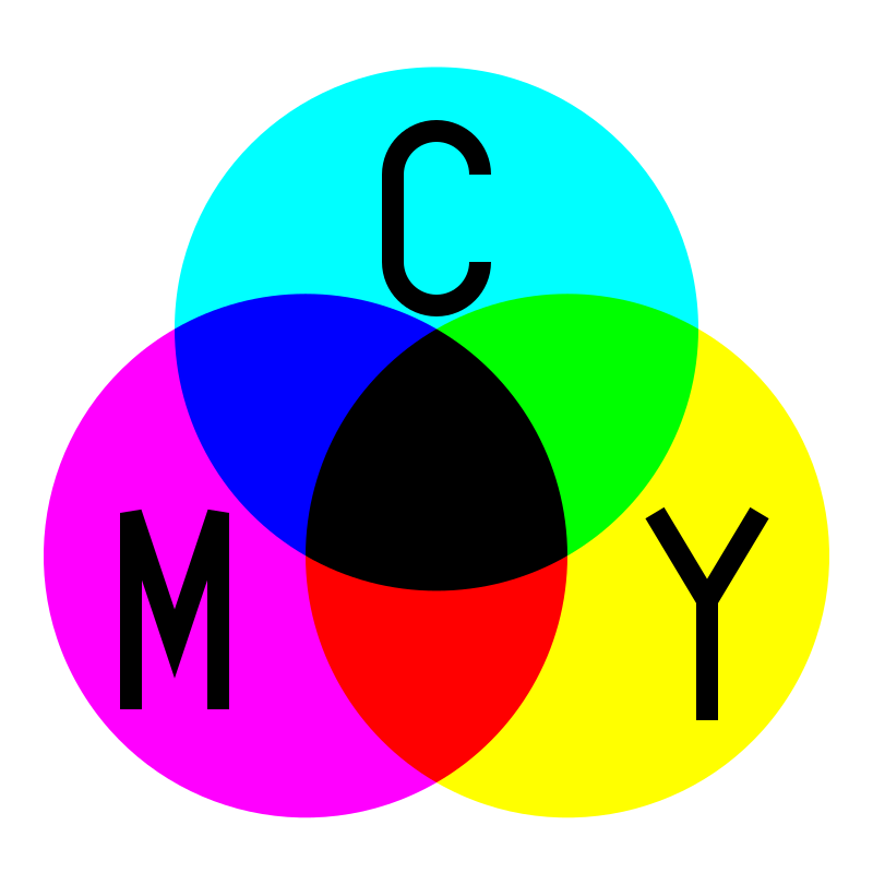
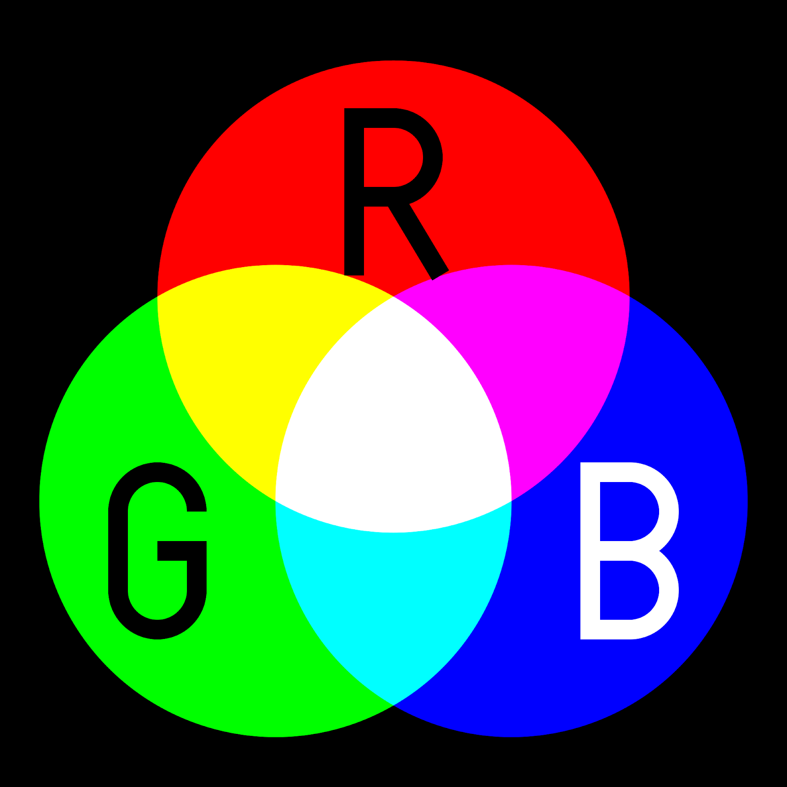
RGB: additive color mixing model vs. CMYK: the subtractive color mixing model
RGB, the additive mixing model, allows you to create colors by mixing red, green and blue (RGB) light sources. The more light you add, the brighter the color will become. If you mix all three colors of light (red, green and blue) the result will be white. The RGB color mode should be used when designing for digital. The reason that RGB is the standard color mode for digital design is that it offers the widest range of colors by combining the primary colors of red, green and blue.
However, you also have CMYK mode, which is the ideal color mode to use when designing for print. CMYK works in an entirely different way than RGB, and instead of “additive” types of color, CMYK uses the subtractive colors of cyan, magenta, yellow and key. Key is another name for black. When you add all of the colors together in the RGB color mode, you achieve white, but with the CMYK color mode, the colors are subtractive, so when you add them all together, the colors get darker and you end up with black.
It is important that you design in the CMYK color mode if you are designing for print. If you design using RGB, your printed product will likely come out with the colors appearing differently than they did on the screen. If you do design your project using the RGB color mode, make sure to convert your project to the CMYK color mode before submitting it for print.

Shop Saddle Stitch Booklets at Printivity 
Shop Folders at Printivity 
Shop Postcards at Printivity


